Logo Menu

Photographing
Omega Seamaster
145.016 1969

How I shot this photo - using a piece of driftwood for background and extra red light for accent.
Jan 20th, 2025

Studio Setup

After I had "created" the shot in my mind, I set up my studio setting. What I used - Fujifilm X-H2 camera, Fujifilm 80mm macro lens, Aputure LED 200W light, Lee white diffusion, white foam-cardboard reflectors, IKEA black glossy glass, small RBG light to create red accents, table, tripod, "helping hands" clamps, Sirui C-stand, light stands (for diffusion sheet).

I bought this piece of driftwood from a local pet shop that sells these for aquarium use.

Studio setup

First things first - shooting the watch

My goal was to create a true “hero photo” of this vintage Omega Seamaster by combining a dark grey background with a piece of driftwood as the main prop. The organic shape and texture of the wood contrast nicely with the refined lines of the gold case, while subtle red accents add a bit of tension and warmth to the scene. This combination helps the watch stand out while still feeling grounded and natural.

There are multiple ways to approach a setup like this, but I chose to shoot from a relatively high angle - around 70 degrees. This angle was selected mainly to control reflections from the diffusion scrim on the dial. At lower shooting angles, the dial quickly becomes washed out due to the large, soft light reflecting directly back into the lens. The effect is especially noticeable on polished metal elements such as the applied hour markers and the logo.

By increasing the camera angle, I was able to reduce these unwanted reflections while still maintaining even illumination across the dial. This also helped preserve contrast and legibility, allowing the details of the chronograph layout to remain clearly visible. At the same time, the chosen lighting angle creates gentle shadows around the recessed subdials, which adds depth and emphasizes the three-dimensional structure of the dial.

I deliberately avoided using a flag (such as black cardboard) to block the diffusion reflection from the dial. While flagging can be effective, it often changes the overall character of the light too much, resulting in a dial that looks flat or unnaturally dark. For this watch, it was important that the dial remained well-lit and balanced, even if that meant carefully fine-tuning angles instead of blocking light.

The final result is a clean but dramatic image that highlights the watch as the main subject, while the background and prop support the composition without overpowering it. The behind-the-scenes setup shows how much of the final image comes down to small adjustments in angle, light placement, and reflection control.

Not so lovely light on the watch

Creating the light and gradient background

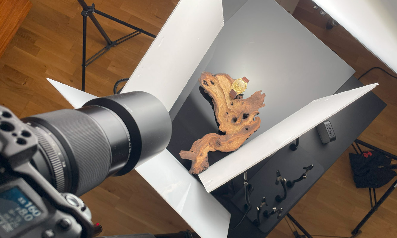
My main light was set to full power and angled down at roughly 45 degrees, positioned behind a LEE white diffusion scrim. The distance between the light and the scrim plays a crucial role here, as it directly affects how wide and soft the gradient reflection appears on the black glass surface. A closer light creates a tighter, more defined hotspot, while increasing the distance produces a broader and smoother gradient.

I also moved the light through multiple positions during the shoot to find the most pleasing "center spotlight" reflection on the glass. Even small shifts had a noticeable impact on how the reflection interacted with both the watch and the driftwood, so this step required some trial and error.

The black glass I used had visible scratches, and to speed up the workflow in post-production, I decided to minimize their visibility optically rather than retouching them later. I did this by using a wider aperture to blur the background slightly. This approach reduced the visibility of imperfections while adding a subtle separation between the watch and the background.

Using a wider aperture also meant that I had to rely on focus stacking to achieve sufficient sharpness across the watch. 
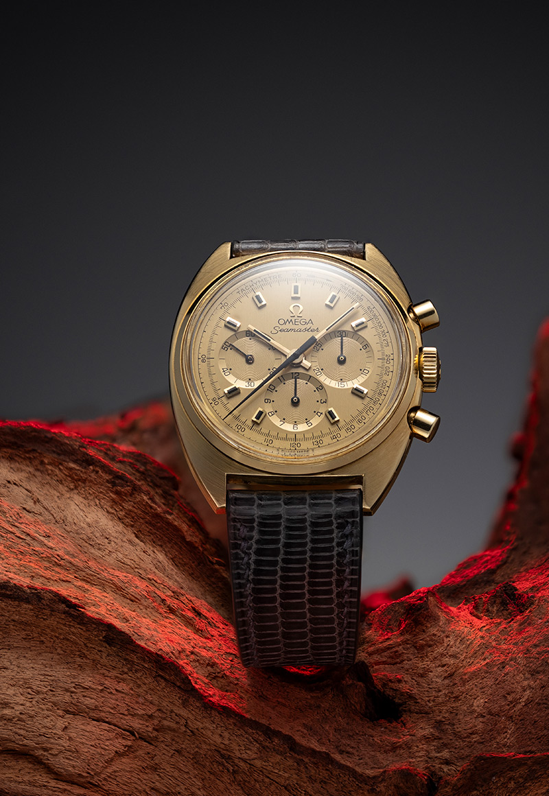
In the final image, you can see that the furthest parts of the driftwood remain softly out of focus, which was an intentional choice to keep attention on the watch while still preserving depth in the scene.

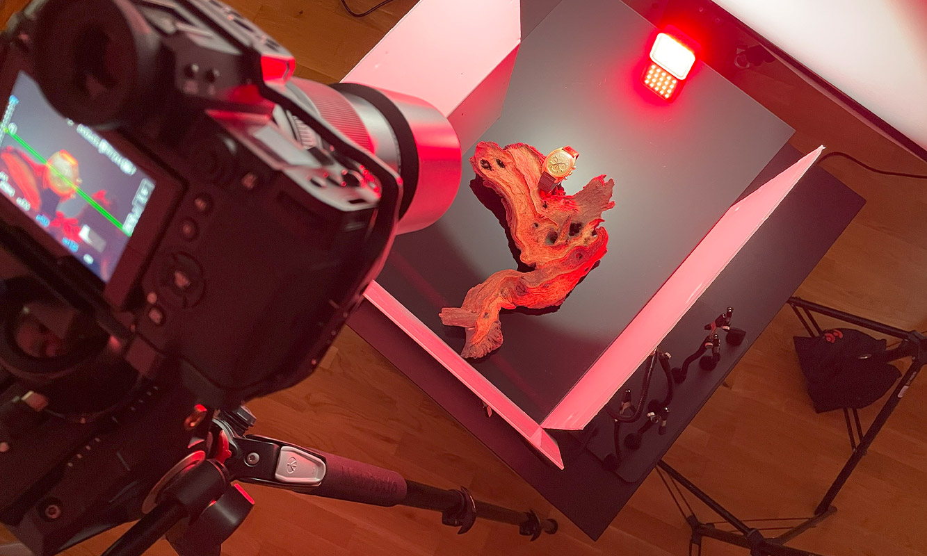
It quickly became clear that a single exposure wouldn't work for this setup. The RGB LED light used to add red accents would also influence the exposure and color of the watch itself. To solve this, I created a composite from two separate focus-stacked 
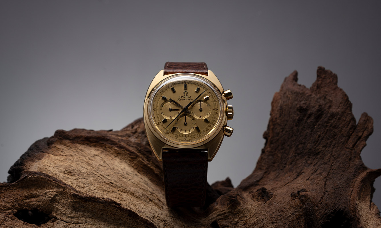
image sets. The first stack consisted of 70 images, capturing the watch and scene exactly as I wanted them to appear in the final result.

The second stack was shot with the RGB LED light positioned at the top edge of the IKEA glass. This pass was used exclusively to "paint" selective areas of the driftwood with red light, adding atmosphere without contaminating the exposure or color of the watch.

After capturing both image sets, I performed basic adjustments in Camera Raw. I then used Helicon Focus to stitch the focus stacks together. While this process could also be done in Photoshop, Helicon Focus is significantly faster for large stacks and consistently delivers cleaner results, which makes it my preferred tool for this type of work.

Shooting Omega Seamaster
Focus stacking the image

Finalizing the photo

After that, I used Photoshop and masking technique to "paint" the red accents into the main shot on the driftwood. I think red added some fine nuances to this photo and worked well with a gold watch. What would I do better next time - I would burn the wood to black and paint it over.

One final alternative shot without red accents.

Omega Seamaster final shots

And this is how it's done! Driftwood is a great piece of prop. Try it out! Feel free to contact me if you have any questions.

View other articles

Close